It doesn’t take much for a presentation to be untidy, look unprofessional, or confuse your viewers. Let’s take a look at common PowerPoint (PPT) mistakes and what you can do to avoid them.
1. Misaligning Content in PowerPoint
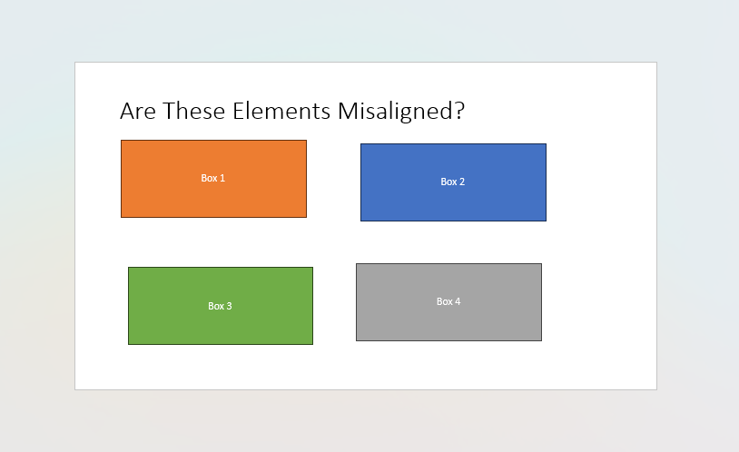
Misaligned objects on a PPT slide jump out like a sore thumb. They look sloppy and tell your viewer that you’ve quickly thrown the slide together without care and attention.
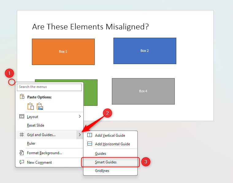
The best solution is to use Smart Guides. This helps you to lock the shapes in position when you click and drag them around the slide. To activate Smart Guides, right-click in the gray area around the edge of your slide and hover over the “Grid And Guides” arrow. Then click “Smart Guides” if there is not a check mark already next to that option.
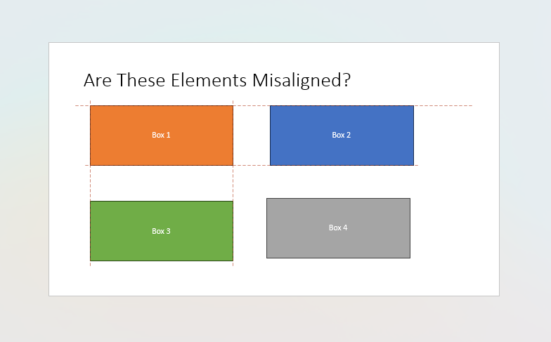
As you can see below, after activating Smart Guides, we clicked and dragged Box 1, and PPT not only showed us the shape’s alignment relative to the other objects on the slide but also encouraged us to lock them together.
You can also use PPT’s in-built Gridlines feature to line up your shapes manually.
2. Having Too Many Bullet Points in PowerPoint
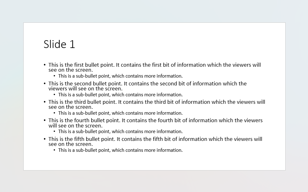
This is a nightmare for audiences! It’s uninspiring, daunting, and amateur. As a general rule, avoid having too much text on any PPT slide—however, if it’s all vital information that you can’t reduce, there are better ways to present your material.
The best way to overcome this is to use PPT’s SmartArt feature.
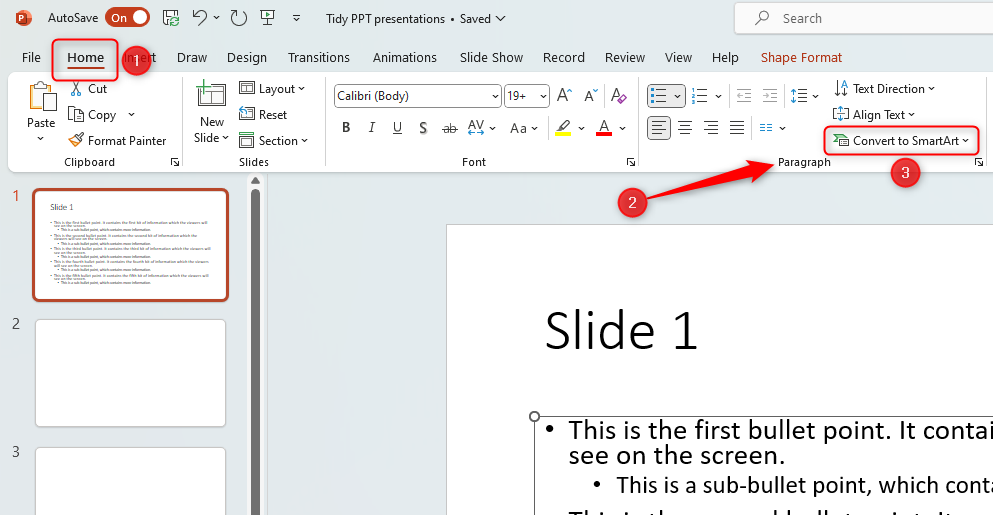
If you have already typed your text and want to convert it to SmartArt, with the text box in question selected, open the “Home” tab on the ribbon, and in the Paragraph group, click “Convert To SmartArt”.
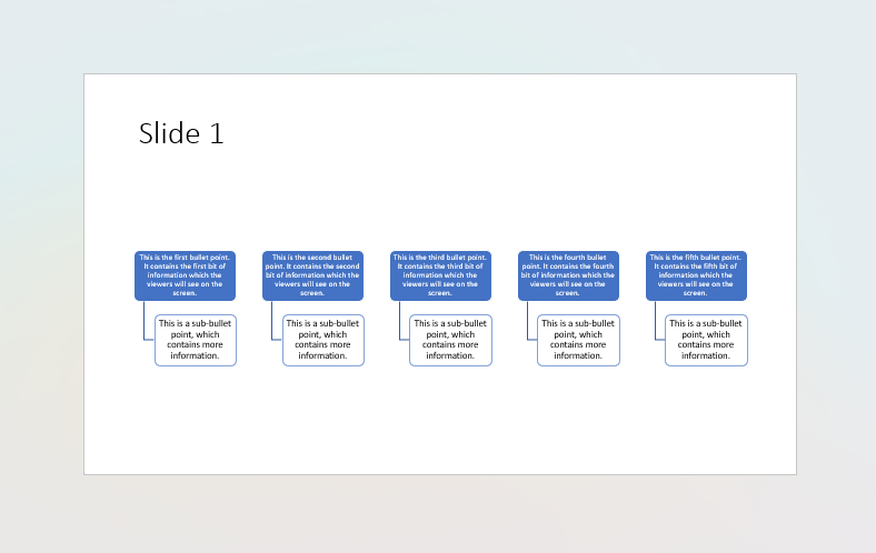
You will then see a whole host of designs open, which you can hover over to see what they look like. Click the desired layout.
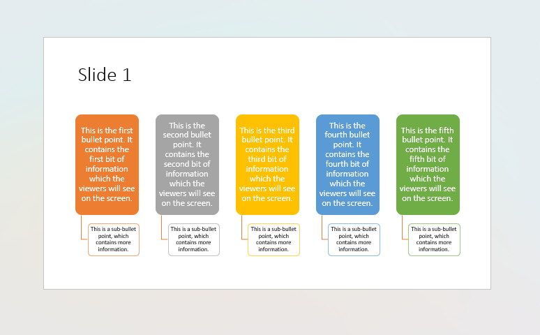
But remember—our aim is to make the slide more presentable and easier to read and digest. At the moment, this slide still looks uninspired and difficult to read. To adjust this, simply select the elements you want to amend and make the required changes, such as resizing the boxes, adjusting the font sizes, or opening the “SmartArt Design” tab on the ribbon.
To select more than one item at a time (for example, in the screenshot above, you might want to amend all the blue boxes at the same time), click one shape, hold Ctrl, and then click the remaining shapes, before then releasing Ctrl. Adjust one of the selected shapes and they will all change together.
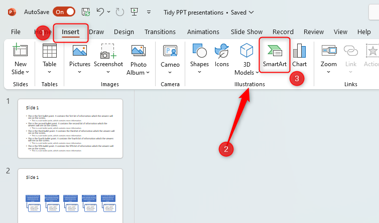
If you haven’t yet typed your text, but you know you want to use SmartArt, make sure you haven’t clicked on any text or images within your PPT slide, then open the “Insert” tab, head to the “Illustrations” group, and click “SmartArt”.
You can then choose from the array of options that appear.
3. Using Too Many Animations and Transition Effects in PowerPoint
Animations are a good way to emphasize details within your PPT slide or gradually introduce information step-by-step when you are presenting. Transitions between slides can look professional and slick. However, overusing these features can distract your audience and look tacky.
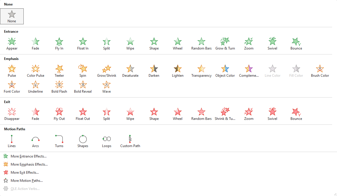
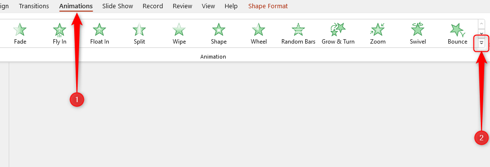
To access the Animations, click the item you wish to animate and choose the effect in the “Animations” tab. You can see more options by clicking the “Animation Styles” drop-down arrow on the right-hand side.
Transitions are how your PPT presentation moves from one slide to the next. They can be accessed in the “Transitions” tab.
We suggest keeping animations and transitions to a minimum, both in terms of quantity and type, by sticking to these rules:
- Ask yourself, “Does this make my presentation better?” If the answer is no, don’t put it in.
- Use slick effects that last less than one second without you having to change the speed of the animation. Fade and Cut are our favorite transitions, as they look professional and are quick, and Appear and Fade are optimal entrance animations.
- Use the same transition effect for each slide, and the same animation for each item.
- Try to avoid adding more than one animation to each item.
To achieve consistency, use Excel’s Slide Master. Instead of adding animations and transitions to each slide individually, the Slide Master lets you do this with one simple click.
4. Using the Wrong Color Combinations in PowerPoint
The latest versions of PPT offer us a wide range of colors. However, if you’re not careful, you can cause your reader to suffer from eye strain by choosing the wrong combinations.
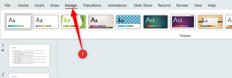
The best way around this is to use PPT’s “Color Variants” mechanism. In the “Design” tab on the ribbon, go to the “Variants” group, and click the drop-down arrow.
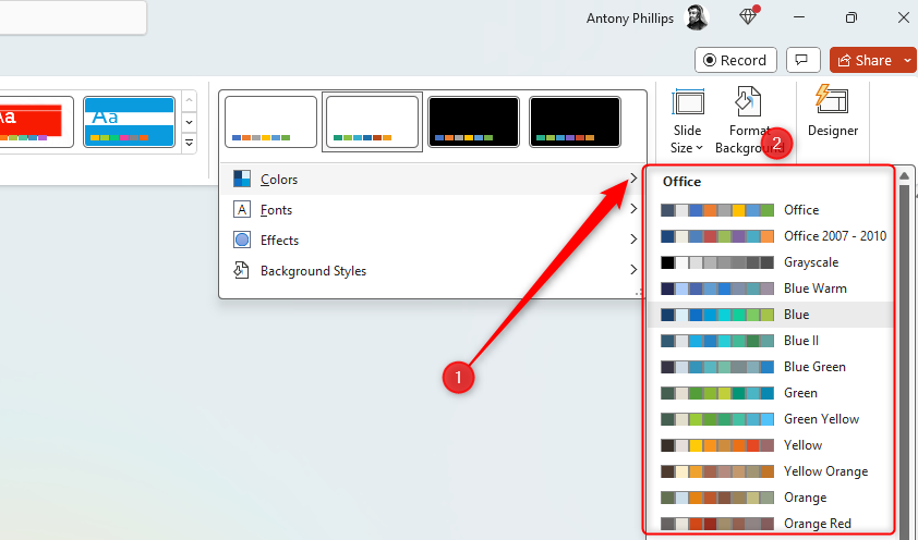
In the resulting menu, hover over “Colors” and choose a variant you like.
Now, whenever you add text or change the color of an element within your presentation, you can choose from the selected color palette, which will help you to avoid poorly contrasted colors. Also, try to stick to these rules:
- Don’t use red text. This often washes out when projected, especially on a poor-quality projector or if the sunlight hits your projection screen. The worst color combinations are blue with red, and green with red. Avoid these at all costs!
- Aim for dark fonts on a light background, or light fonts on a dark background.
- Never use colored fonts for emphasis—this can cause issues for audience members who are colorblind.
5. Using Low-Quality or Distorted Images in PowerPoint
Images look great in PPT, but people often forget that their presentation will be displayed on a large screen, so they need to have an appropriate resolution. Use an image with a minimum of 150 pixels per inch (PPI) or upscale your image to avoid blurriness.
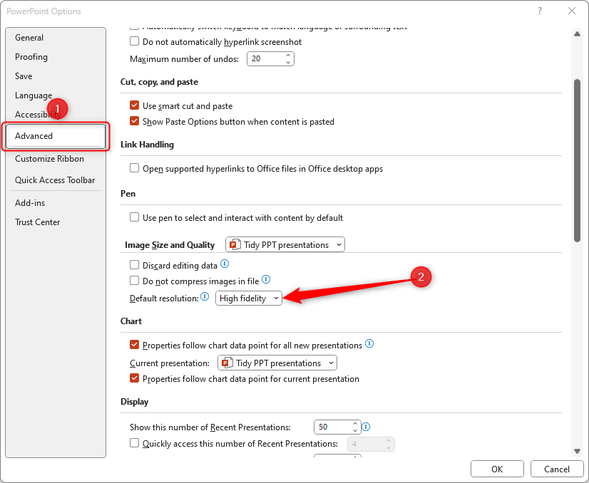
You can also force PPT to use the maximum possible image resolution. To do this, click “File” (in the top left of your PPT window), and open “Options” (at the bottom of the menu that opens). In the dialog box, click “Advanced” and change “Default Resolution” in the “Image Size And Quality” section to “High Fidelity”.
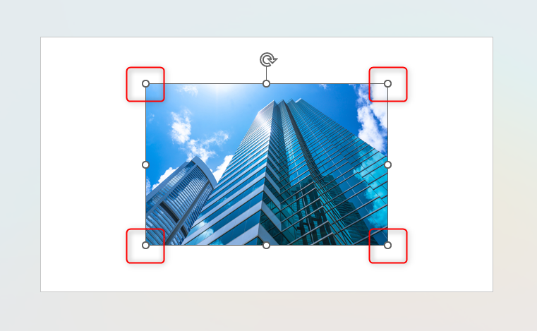
Finally, when you resize an image, make sure you do so from the corner handles. This will maintain the correct proportions and avoid squashed or stretched images.
6. Inconsistency Between PowerPoint Slides
When you move from one slide to the next, your audience will immediately spot inconsistencies. One way to get around this is to copy (Ctrl+C) and paste (Ctrl+V) the whole slide, before then amending the contents.
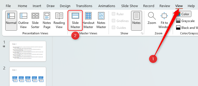
However, the best option is to use PPT’s Slide Master, which you can access through the “View” tab on the ribbon.
Edits you make in the Slide Master will affect the content in each slide layout, meaning you can guarantee consistency between your slides.
7. Using Hard-to-Read Text in PowerPoint
Follow these rules to make sure your text is easy to read:
- You might think that using fancy fonts looks good in your presentation, but the best bet would be to use a sans serif font.
- Avoid too much text and use a larger font. If your font is too small because you have a lot of text on a slide, either split what you’ve typed into two slides or reduce the content volume.
- Avoid using red font. This doesn’t work well on a projector, especially if the sunlight hits your projection.
8. Using Pictures or Patterns as PPT Slide Backgrounds
You might want to use a picture or a pattern for your slide’s background, but this can make your text difficult to read.
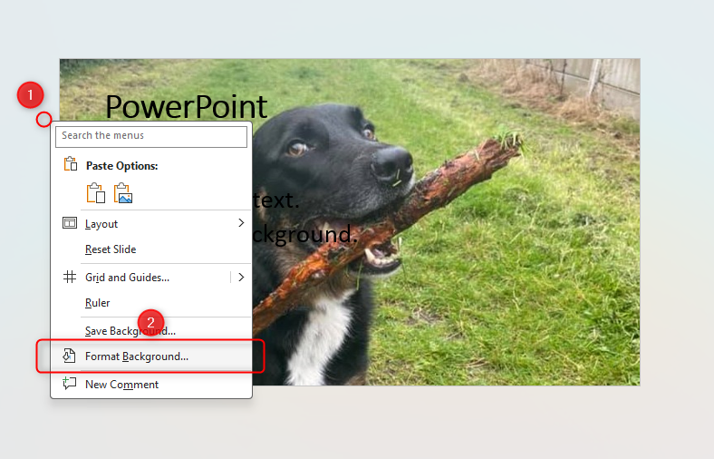
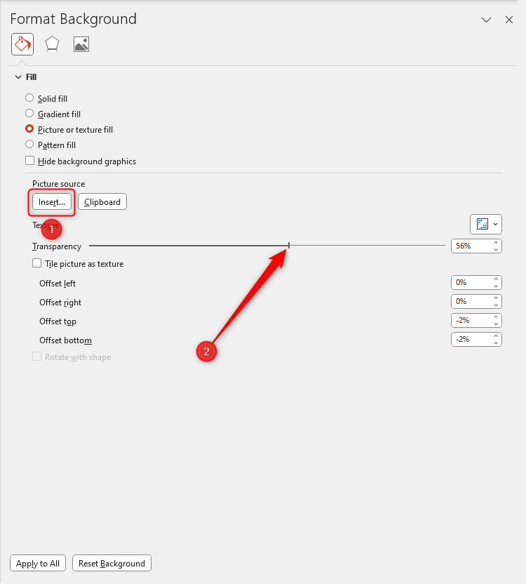
To counteract this, simply use a plain background. However, if keeping the picture is a must, increase its transparency. Right-click the gray area surrounding your slide, and click “Format Background”.
In the pane that opens, insert your picture and move the Transparency slider to the right, until you’re happy that the text can easily be read.
You can now keep your picture and your audience will be able to see your text.
Now that your slides are properly formatted and ready for presentation, you might want to add a table of contents to your PPT presentation or print a condensed version of PPT slides for your audience.
source
